Innovation meets tradition
KLAUS KUNSTSTOFF
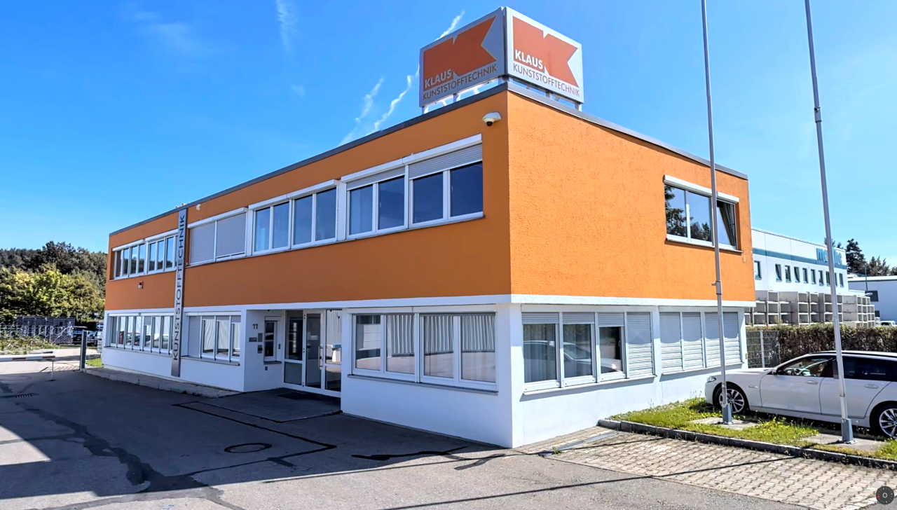
The existing logo served as the starting point for a comprehensive redesign. Through several stages of iteration, we deliberately moved away from the previous visual identity and developed new visual approaches. The focus was on exploring alternative directions and reimagining the brand’s potential. The designs shown here document this process—even though they were not implemented in this form.
Project Services
Three directions, one origin
As part of the project, three different design directions were developed to gradually transition the existing logo into a new visual identity. The variants present alternative approaches to further development and each interpret the existing brand foundation in their own way. The focus was on a conceptual exploration of the logo’s form, structure and impact.

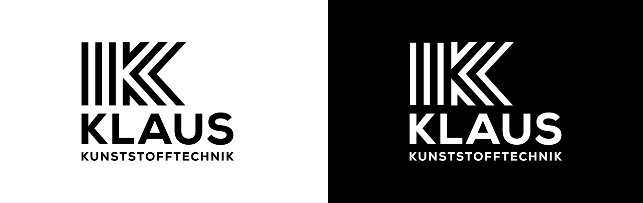
Starting from the original ‘K’, the symbol was completely reinterpreted in a multi-stage process. First, it was transformed into simplified outlines, followed by a deliberate division into two separate elements. These were then further abstracted and converted into a linear system. The resulting negative space was incorporated into the design and supplemented with additional lines, creating a new rhythmic structure. Finally, line thicknesses were harmonised and the overall form was optimised and refined through targeted adjustments.
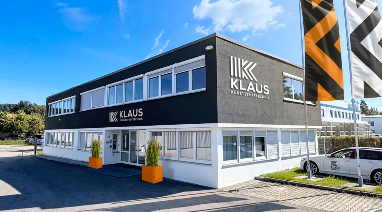

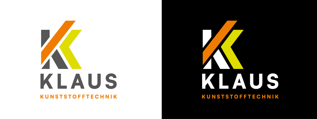
In this approach, the original ‘K’ was deliberately discarded and replaced with a design derived from a newly defined typeface. Building on this, the form was divided into three parts, the elements of which were deliberately offset against one another and their spacing reorganised. By doubling the character, the alliteration ‘KK’ (Klaus Kunststofftechnik) was adopted as a structural principle.
As the design progressed, elements of the second ‘K’ were condensed into an arrow-like shape, creating a clear sense of direction. The final adjustment – shifting the central element and aligning it to the left – further sharpened and stabilised the overall composition.
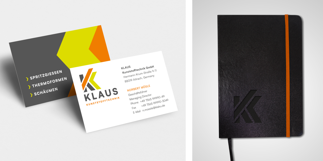
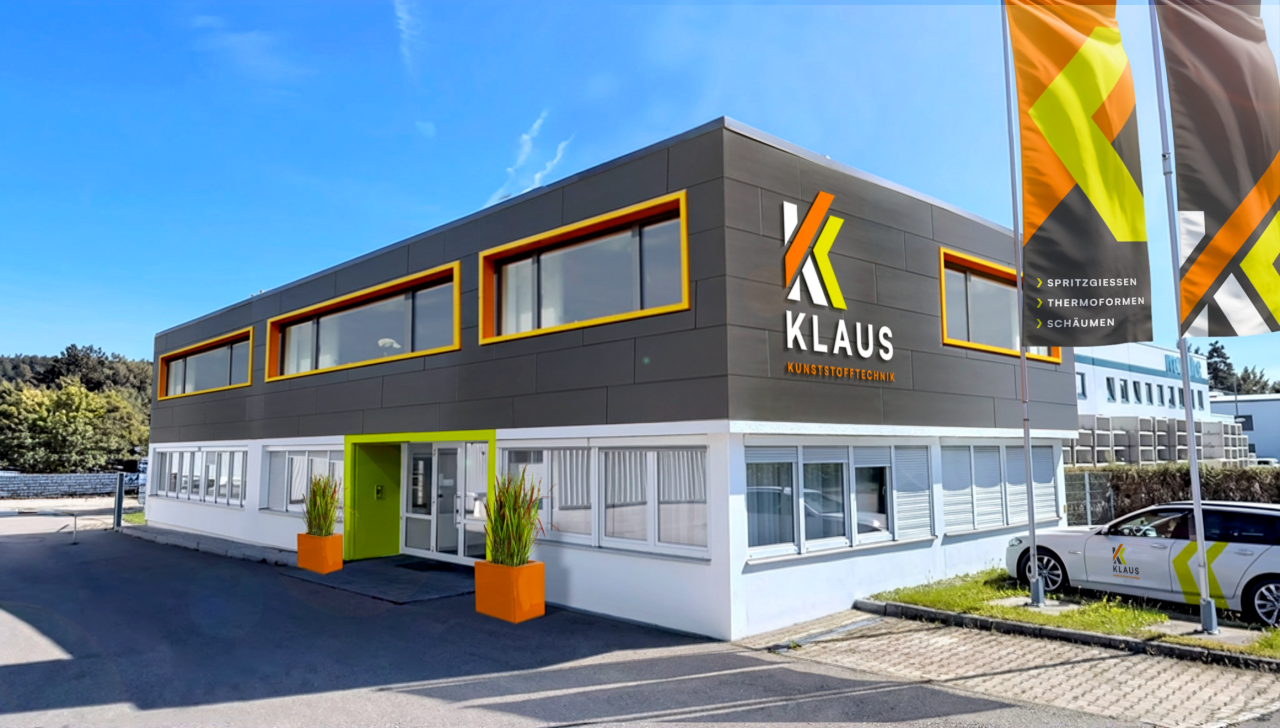

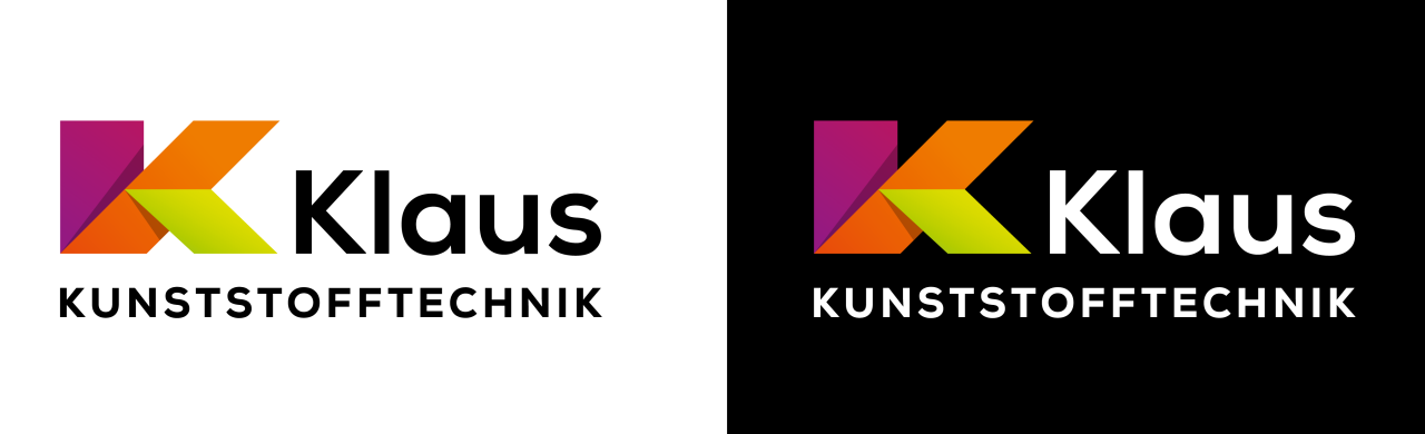
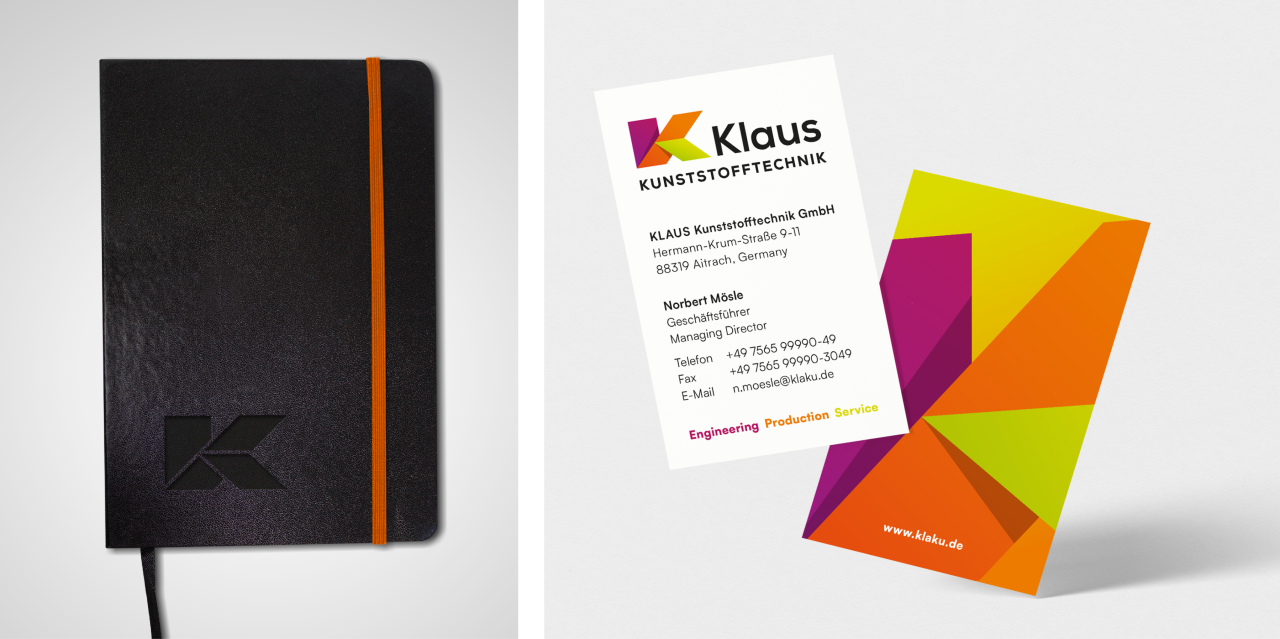
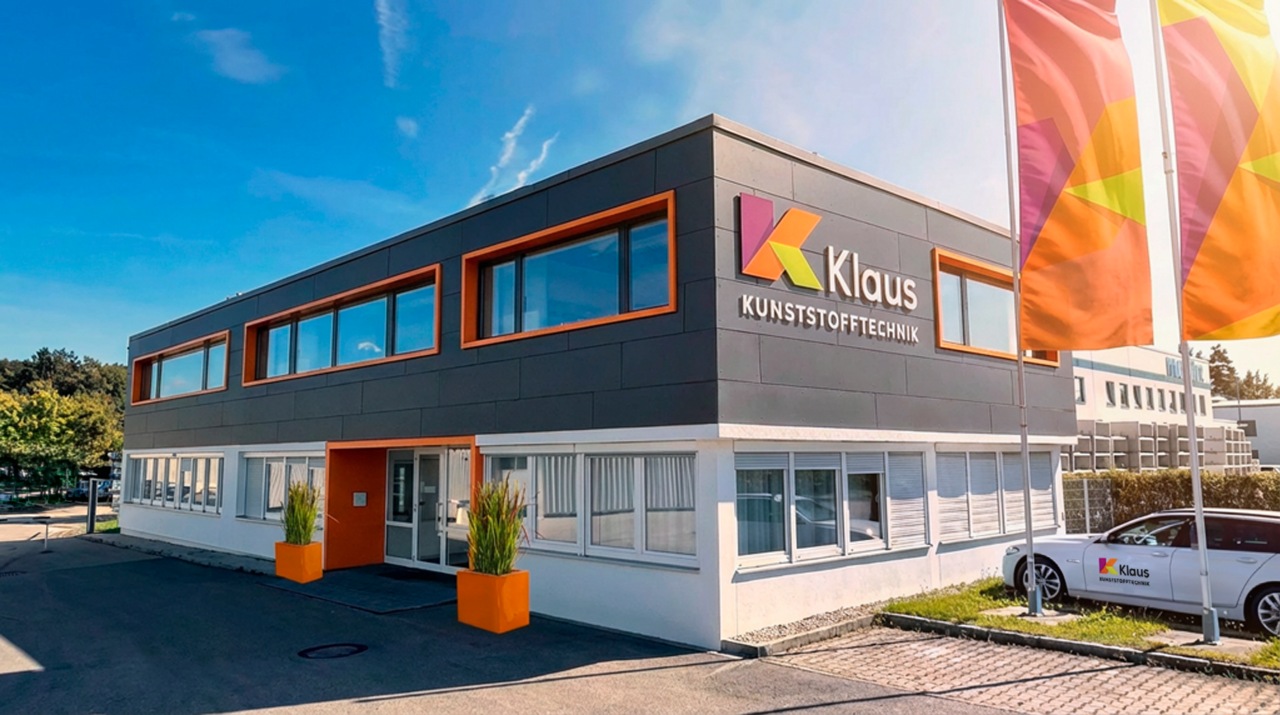
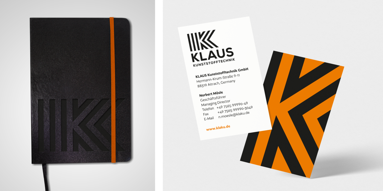
In the third approach, the original ‘K’ was once again taken as the starting point; it was first broken down into several elements and then gradually further refined. From this fragmentation, a form emerged comprising three clearly defined surfaces that come together to form a distinct symbol. As the design progressed, dividing lines were reduced in order to consolidate and harmonise the composition. The final design and 3D rendering establish a visual connection to the material properties of plastic – its malleability, precision and structural clarity.